
In times like these, we need to identify what direction the market is moving and which sectors will benefit from the move. We start by looking at emerging sectors.
Identify Emerging Sectors
Monitor industries that are starting to show strong performance and gaining investor interest. This can be done by:
- Tracking Sector ETFs: Keep an eye on sector-specific ETFs to see which ones are showing relative strength.
- Economic and Market News: Stay updated with economic reports and market news to identify sectors benefiting from current economic conditions.
- Technical Analysis: Use technical indicators like the Relative Rotational Graphs and Relative Strength indicator.
2. Select Strong Stocks within Emerging Sectors
Once you identify strong sectors, look for individual stocks within those sectors that are breaking out. Use criteria such as:
- High Relative Strength: Stocks outperform the broader market and their sector.
- Volume: Increased trading volume can indicate strong institutional buying.
- Fundamentals: Strong earnings growth, revenue growth, and healthy balance sheets.
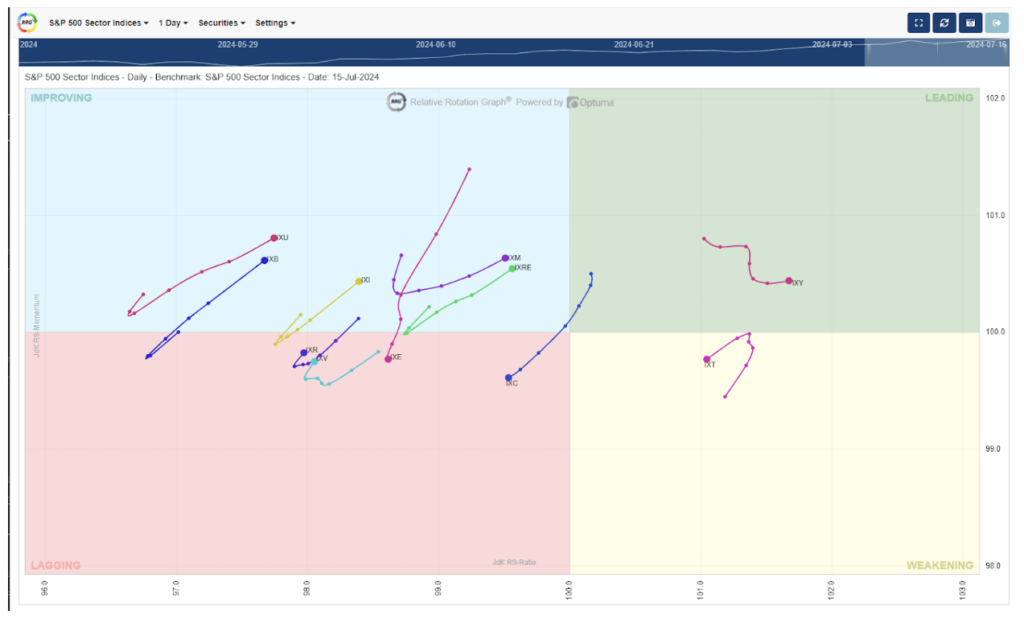
With that out of the way, let’s look at Relative Rotational Graphs. There are four quadrants based on relative strength and momentum. The top-right quadrant is Leading, followed by Weakening (in the bottom right), then Lagging (lower-left), and finally the Improving quadrant in the top left.
Each sector is listed with the current data being a large dot located in a quadrant. The “tail” of each sector represents where the sector was located over previous sessions, in this case, the previous six days..
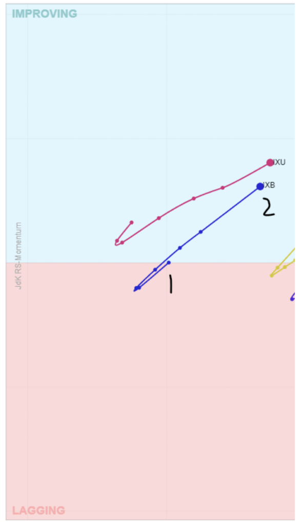
Let’s look at the chart, zoomed in. IXB in the chart represents the S&P 500 Materials sector. The number 1 shows where the sector was located 6 days ago, which was in the lagging quadrant. Over the last 6 days, the sector have been gaining in momentum (moving up vs down) and has been increasing in relative strength compared to the other sectors (moving right vs left). Since the sector has gained in momentum and relative strength, the sector moved from the lower left to upper right and into the Improving quadrant.
Going back to the chart with all sectors, we can see the following:
Utilities (IXU): Improving
Materials (IXB): Improving
Industrials (IXI): Improving
Consumer Staples (IXR): Lagging, but made the turn and now pointing toward Improving
Health Care (IXV): Lagging, but made the turn and now pointing toward Improving
Energy (IXE): Lagging
Financials (IXM): Improving
Real Estate (IXRE): Improving
Communication Services (IXC): Lagging
Consumer Discretionary (IXY): Leading, but flattening momentum
Technology (IXT): Weakening, and pointing toward lagging
I would certainly be looking at stocks in a sector that is located in the Improving or Leading quadrant and having the tail pointing up and to the right.
Another way you can look at relative strength is using an indicator within your broker platform.
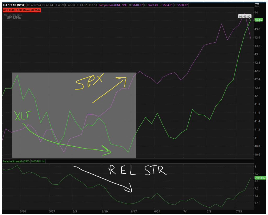
Using Schwab’s ThinkorSwim platform, you can use the Relative Strength study on your chart. The top chart shows the price performance of the S&P 500 (SPX) (purple line) vs the Financials ETF (XLF) (green line). The indicator on the bottom is called Relative Strength and it compares the price performance of the stock/ETF selected compared to a symbol you select, like the SPX.
Looking at the chart, we can see that in June as the XLF sold off from $42.50 to $40.80 (upper green line), the SPX (purple line) was improving performance-wise. Therefore, the Relative Strength indicator headed lower.
With me so far?
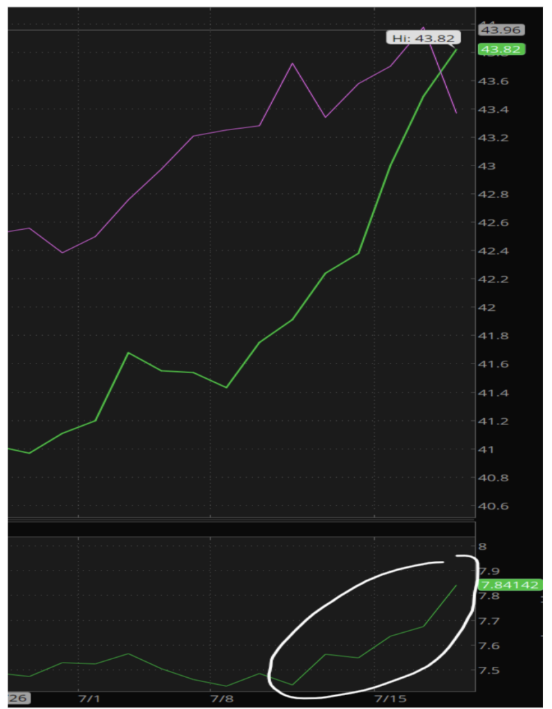
Now, if you look at the far right of the chart, you can see that the Relative Strength indicator has taken off over the last few days. This is due the the Financial sector (XLF) gaining in price performance over the S&P 500 (SPX).
Earlier I mentioned looking at breakouts of the top relative strength sectors and then looking at the top performing stocks within that sector.
My theory was that as more and more people anticipated the Fed lowering rates, that would help the Financial sector. Then we had some of the big banks crush earnings. I then looked at the relative strength to see XLF not only outperforming the SPX, but its relative strength compared to the SPX was gaining faster than other sectors.
I started looking within the sector to see which stock had room to run and in front of a live audience, we traded JP Morgan (JPM). Within an hour we closed out of a trade with a 10% gain on risked capital!
If you want to see more about how we did what we did and the options technique we used to create this winning trade, I encourage you to check out our upcoming Millionaire’s Trading Club event held in Las Vegas in October. We’ll be teaching you how you can make trades just like this. We have special guests, food, trades, and so much more!
If you want more information about MTC 2024, check out this link. Don’t hesitate because our list of attendees is growing and our seats (in-person and virtual) are limited!